Designer
Explore selected workI’m Melike Kara, a product and visual designer studying Arts and Entertainment Technologies at UT Austin. My work spans digital interfaces, game UI, graphic design, 3D, and animation.
I enjoy figuring out how something should work and how it should feel. Whether I’m designing a product screen or a game interface, I pay attention to the small choices—layout, type, color, and movement—that make an experience easier to understand and more enjoyable to use.
UX internship at IBM. Designed an incident-detection flow built around human-in-the-loop approval and transparent reasoning — informed by 11 enterprise interviews and a competitive analysis of 7 platforms.
Read the case studyA guided workflow for moving pipeline jobs between environments, making naming conflicts and dependency decisions visible before anything is overwritten.
Read the case studyAn interactive Le Pliage product page exploring color selection, product details, and transitions.
View the projectA wellness and home-management interface bringing daily routines into one ambient display.
View the project
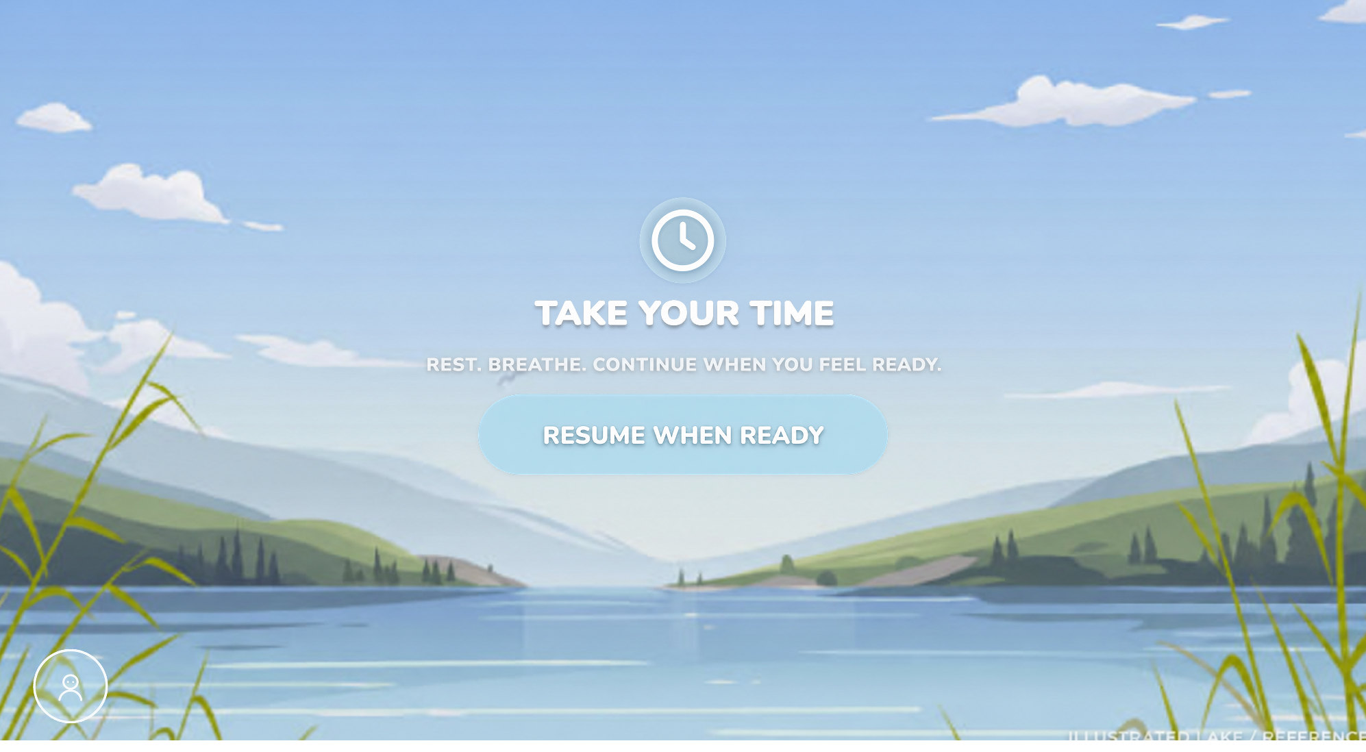
In-game guidance, progress feedback, and pause flows, with buttons, typography, and color designed as one interface system.
View the projectAutodesk Fusion 360 · Autodesk Maya · Substance 3D Painter
View the projectAutodesk Maya · Substance 3D Painter
View the projectA poster series using minimal shapes and repeating typography to explore food insecurity and fading public awareness.
View the projectAn editorial layout highlighting women in type-design history, pairing archival photography with a bold pink, black, and white palette.
View the projectAn artist poster combining Cosima von Bonin’s sculptural work within a silhouette, with typography reflecting humor in her art.
View the projectAutodesk Maya
View animationAutodesk Maya
View animationProcreate · Adobe After Effects
View animationEnterprise data integration platforms force users through dense technical workflows, unfamiliar terminology, and large volumes of information just to complete routine tasks. In a competitive analysis of seven platforms — Fivetran, Matillion, Databricks, Microsoft Fabric, AWS Glue, Informatica, and FME — IBM’s WXDI trailed specifically in AI-assisted workflows, wizard-driven setup, and clear conflict resolution when something fails silently.
I synthesized findings from 11 enterprise interviews — CIOs, data engineers, and ML engineers across banking, healthcare, and retail — and went deeper on Matillion to extract interaction patterns IBM could adapt. Two findings shaped every design decision that followed: agentic actions need a human approval checkpoint, and an agent’s output is only trustworthy if its reasoning is visible.
An AI agent detects a data-quality failure — a schema change silently corrupting records for hours — and has to walk a human through what happened, why it’s confident, and what it costs to wait, clearly enough that they can make a fast, informed call without becoming a data-forensics expert themselves.
A dashboard summary states what’s wrong and what’s already auto-remediated vs. what needs a decision — so attention goes only where it’s needed.
A conversational panel answers “What changed?”, “Why did this happen?”, “Have we seen this before?” on demand — depth is available without being mandatory.
A dedicated confidence-reasoning screen breaks a 94% score into its four contributing signals; a cost-of-waiting screen quantifies the risk of inaction.
A single approval screen states it in plain terms: “The AI owns the investigation. You own production.” Nothing executes without that click.
Once resolved, the agent proposes a monitoring rule so the same failure is caught hours earlier next time — turning one incident into a permanent improvement.
This project strengthened my ability to translate complex enterprise requirements into clear, user-centered experiences — specifically, the skill of designing disclosure sequencing for an AI system. I gained hands-on experience with IBM’s Carbon Design System, using AI tools to accelerate prototyping without skipping design rigor, and balancing transparency, trust, and usability in a high-stakes enterprise decision.
Moving pipeline jobs between environments can introduce naming conflicts and dependency issues. An import that fails without a clear explanation, or overwrites an existing connection without warning, leaves users uncertain about what changed.
I designed a guided workflow that surfaces naming conflicts and dependencies up front. Instead of resolving a conflict silently, the interface presents the available choices: keep the existing item, rename and add as new, or replace.
The flow brings the conflict, the affected item, and its resolution into the same step. Keeping an existing item, creating a renamed copy, and replacing an item remain distinct choices so users can decide how to move their work between environments.
This concept applies the same emphasis on visibility and control as the Incident Agent to a focused enterprise workflow: making a potentially silent change visible and controllable before it happens.
An interactive product-page concept for Longchamp’s Le Pliage bag line. Color selection moves through a two-tone reveal into a focused product view, with a separate details page for dimensions and product information. Designed in Figma to reflect the brand’s minimal, elegant identity.
I designed the product view, color-selection states, and details screen, then connected them in an interactive prototype. The focus was on product presentation and the transitions between browsing and reading details.
Two-tone color reveals carry each selected colorway into the page. A separate details view gives dimensions and product information their own space, keeping the main view focused on the bag.
An interactive mirror-interface concept for daily wellness and household routines. The dashboard brings together schedules, weather, nutrition, hydration, recipes, and food-expiration reminders. Designed in Figma, the interface develops from grayscale layouts into translucent panels shown within a home environment.
I designed the dashboard and wellness screens in Figma, grouping schedules, weather, food reminders, and nutrition information into distinct panels. The prototype connects the overview with more detailed views.
The interface develops from grayscale layouts into translucent panels shown in a home environment. The expanded nutrition screen brings calorie totals, nutrient progress, and meal entries together in one view.
A poster series using minimal shapes and repeating typography to explore food insecurity and fading public awareness.
An editorial layout highlighting women in type-design history, pairing archival photography with a bold pink, black, and white palette.
An artist poster combining Cosima von Bonin’s sculptural work within a silhouette, with typography reflecting humor in her art.
A punch animation created in Maya using a Mixamo rig, with a focus on timing and motion.
A jump animation created in Maya using a Mixamo rig, with a focus on timing and motion.
An idle animation created in Maya using a pre-built rig, focusing on subtle timing and motion.
A hand-drawn morph animation where joy, falling, and rebirth flow into one continuous transformation.
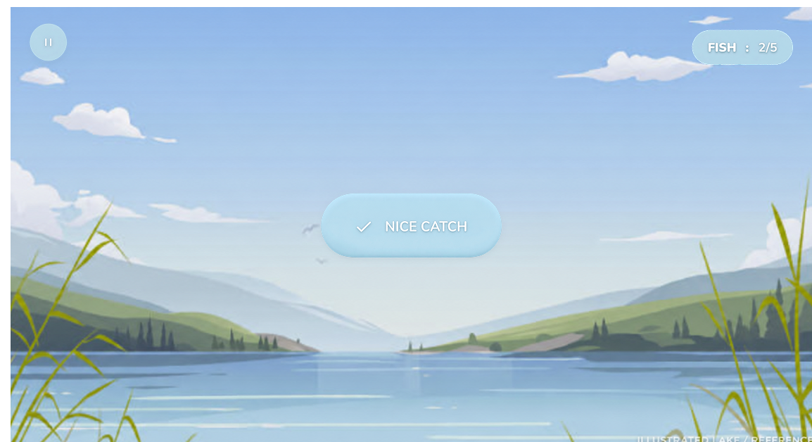
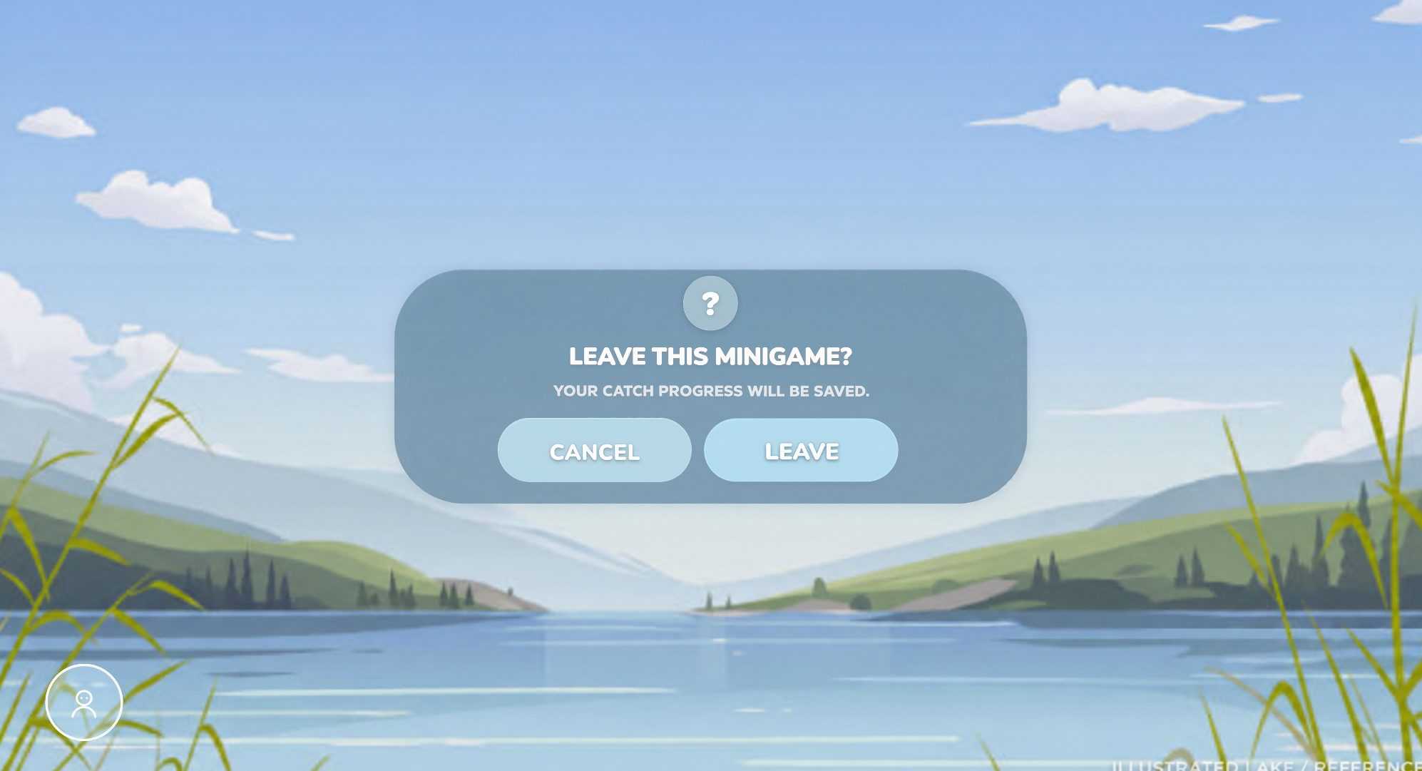
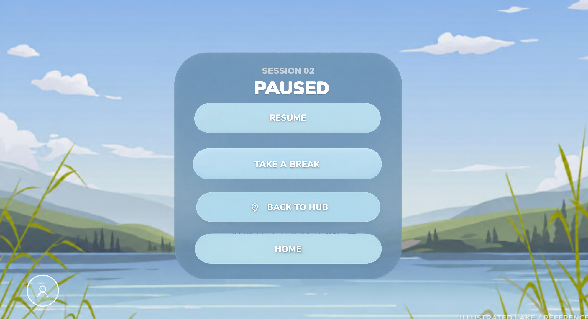
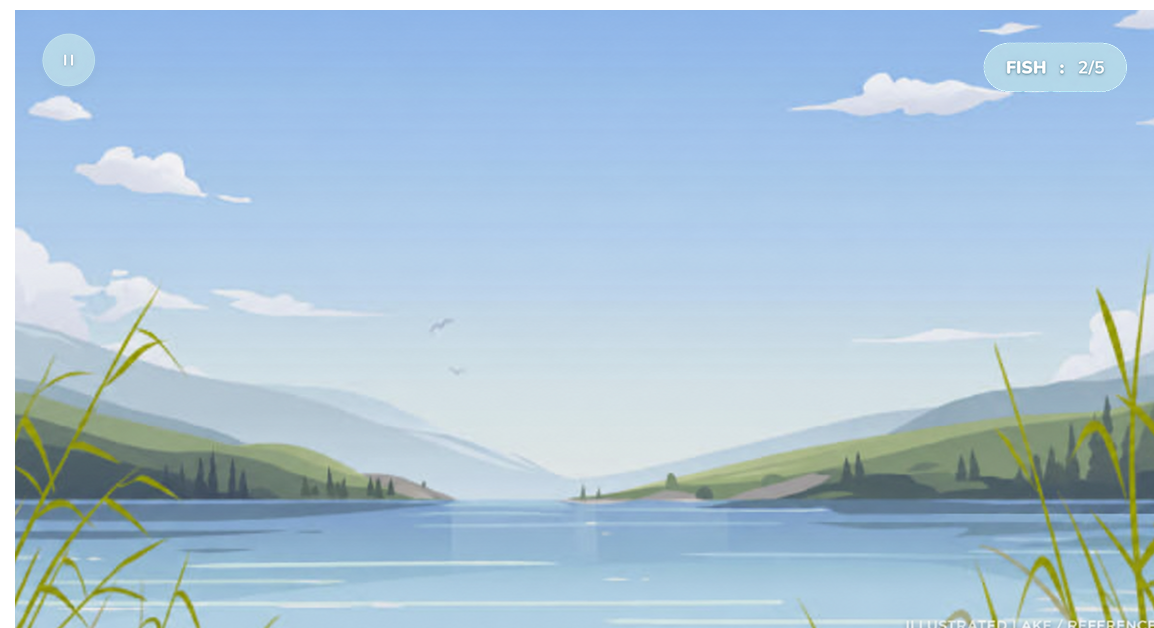
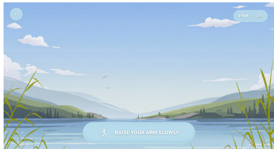
For a collaborative game project, I designed the in-game HUD and pause screens, including buttons, typography, and the color palette. The work covers movement prompts, catch feedback, pausing, taking a break, and confirming an exit.
HUD and pause-screen design · Buttons and icons · Typography · Color palette


Interface mockups shown over an illustrated reference background. My contribution is the UI design.
Rounded controls, white typography, and a cool blue palette carry across the HUD and menus. Movement instructions and catch feedback form distinct HUD states; the pause flow gives separate screens to resting and confirming an exit.
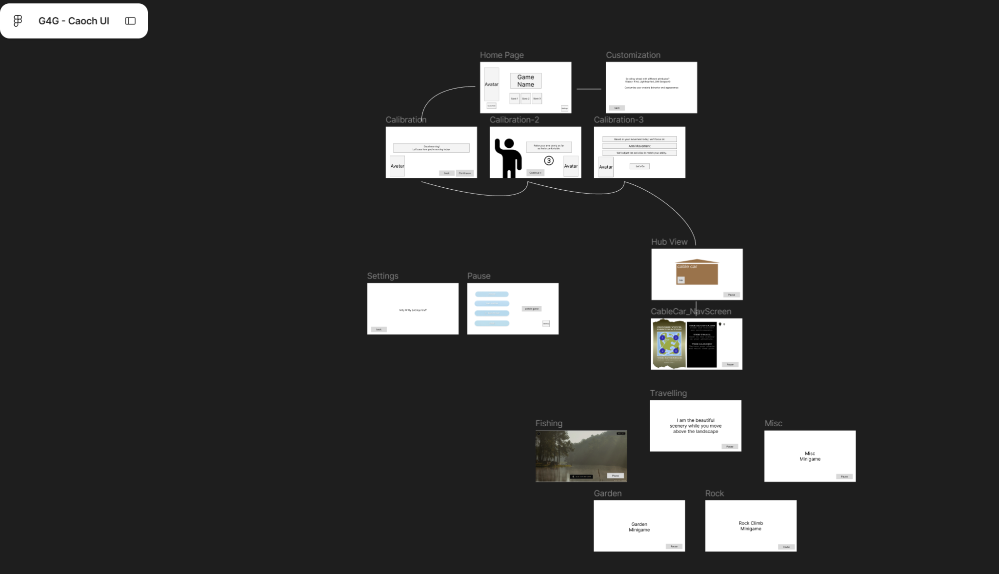
Early navigation map showing how home, calibration, the hub, minigames, and pause states connect.